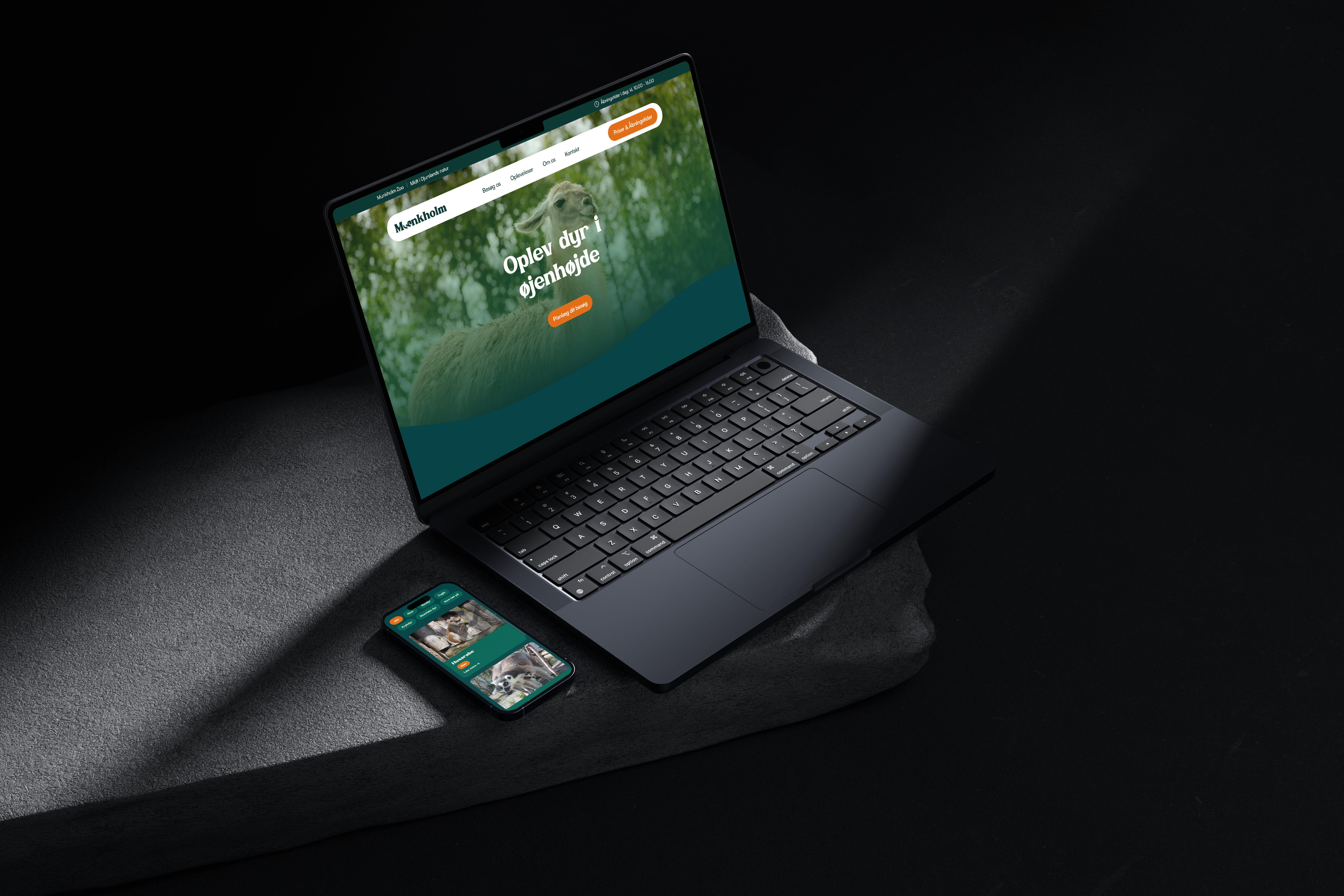




Munkholm Zoo project preview

Munkholm Zoo

Brand identity, Social Media, Web design & Development

About the brand

Munkholm Zoo is a small, family-owned zoo located in Djursland, Denmark. The zoo is built around close-up animal experiences, calm surroundings and a warm, family-friendly atmosphere.

Unlike larger zoos, Munkholm Zoo offers a more intimate and personal experience, where visitors can move through the park at their own pace and get closer to the animals. The brand is rooted in local charm, presence and accessible experiences for both children and adults.

My Role

  • UX Researcher
  • Brand Designer
  • UX/UI Designer
  • Frontend Developer
  • Content Strategist
  • Design System Designer

Tools used

Figma
Figma
HTML
HTML
CSS
CSS
JavaScript
Java
Script
Google Forms
Google
Forms
Maze
Maze

The Challenge

Munkholm Zoo had a strong family-friendly experience, but their digital presence did not fully reflect it. The website was functional, but visually outdated, information-heavy and difficult to scan quickly, especially for users planning a visit on mobile.

The challenge was to create a more modern, warm and cohesive digital identity that made it easier for visitors to find practical information, discover experiences and understand what makes Munkholm Zoo different from larger zoos: a calm, personal and close-up animal experience.

The solution needed to connect website structure, visual identity and social media into one consistent brand experience.


Problems

  • The website, branding and social media felt disconnected from each other.
  • Users needed quicker access to opening hours, prices, practical information and visit planning.
  • The visual identity did not feel as modern, inviting or trustworthy as the experience itself.
  • With most traffic coming from mobile, the site needed a faster and clearer structure.
  • The website provided information, but did not guide users clearly through the visit-planning journey.
  • The current site did not fully show the atmosphere, animal experiences and family value of the zoo.
  • The content had authenticity, but needed a stronger visual system and clearer content direction.

Design process

Empathize

Define

Ideate

Design

Test

Building a seamless digital
experience around real user needs

Survey insights

100% Used websites to find information before visiting a zoo

92.9% Mentioned family experiences as a reason for visiting a zoo

78.6% Found websites frustrating when information was difficult to find

42.9% Pointed to confusing design as a negative factor when choosing where to visit

Desk research insights

60-75% Already use similar experience-based offers and activities

44% Of children wish they spent more time in nature

High demand Families are actively looking for nature-based activities

Lack of inspiration Makes it harder for families to discover new experiences

90% Use the internet to search for information and plan activities

What the insights revealed

The research showed that users were not looking for a complex digital experience. They needed a faster, clearer and more reassuring way to plan a visit.

The website had to prioritise practical information such as opening hours, prices, map access and visit planning, while still creating a stronger emotional connection through animals, atmosphere and family-friendly experiences.

Design goals

1

Make planning easier

Prioritise opening hours, prices, map access and practical information.

2

Create a clearer structure

Simplify navigation and group content around user needs.

3

Strengthen the brand feeling

Build a warmer, more modern and recognisable visual identity.

4

Bring the experience forward

Use imagery, storytelling and content sections to show the atmosphere of the zoo.

5

Connect the platforms

Create consistency between website, visual identity and social media.

From research
to practical UX decisions

01 Opening hours first

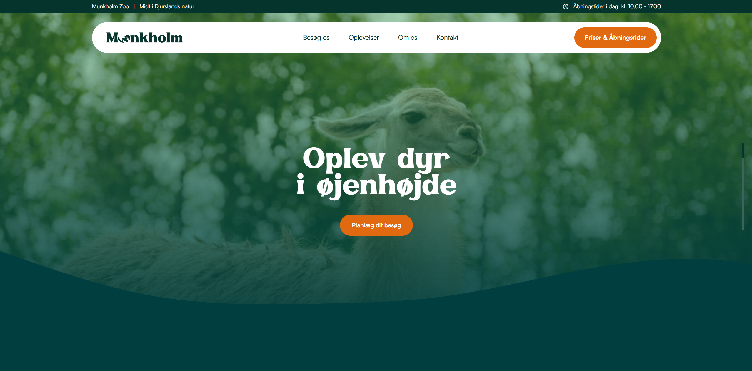
Opening hours were placed in a persistent top banner, making one of the most searched pieces of information visible from every page.

02 Clear visit planning paths

Large CTA cards guide users directly to planning, prices, animals and experiences.

03 Progressive information

FAQ sections and dropdowns reduce information overload and make practical details easier to scan.

04 Mobile-first navigation

The structure was designed to support quick planning on smaller screens.

Creating a warm, modern and recognisable identity

The visual identity was refreshed to feel more modern, warm and family-friendly while still staying connected to nature and animals.

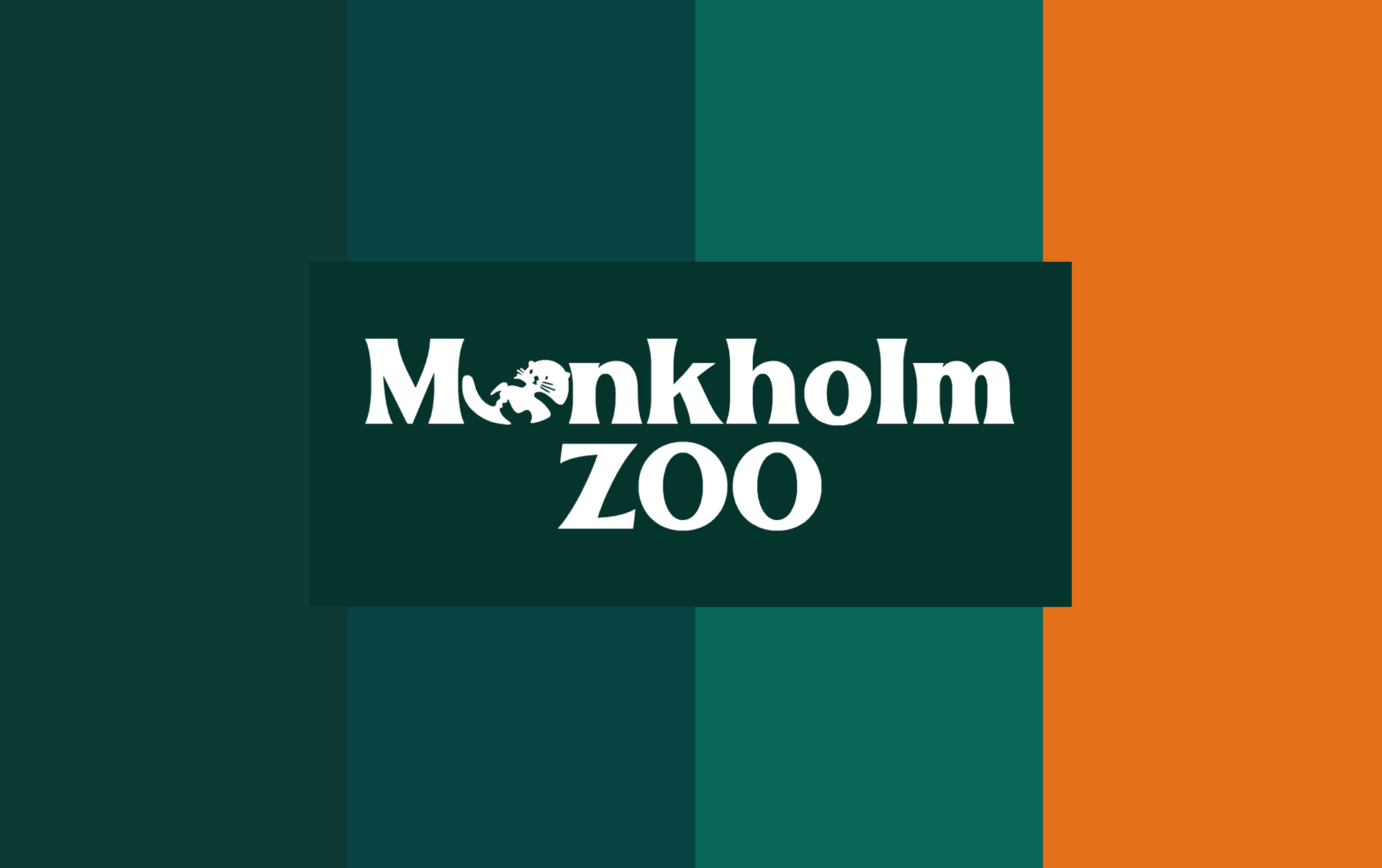
The new system uses a simplified logo, a stronger green color foundation, an orange CTA color and a more playful display typeface to create a clearer and more memorable brand expression.

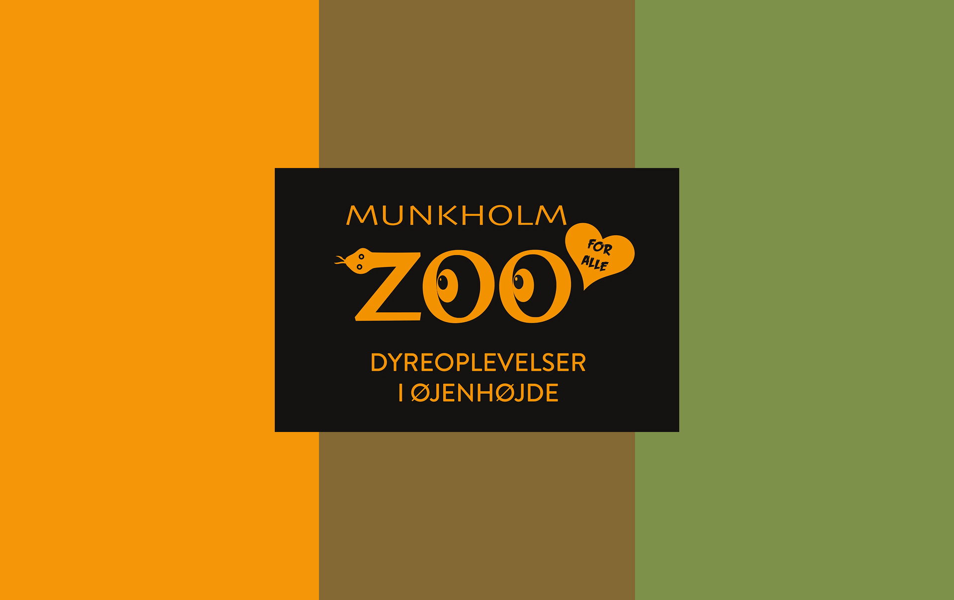
Old and New visual identity

Old Munkholm Zoo visual identity
New Munkholm Zoo visual identity

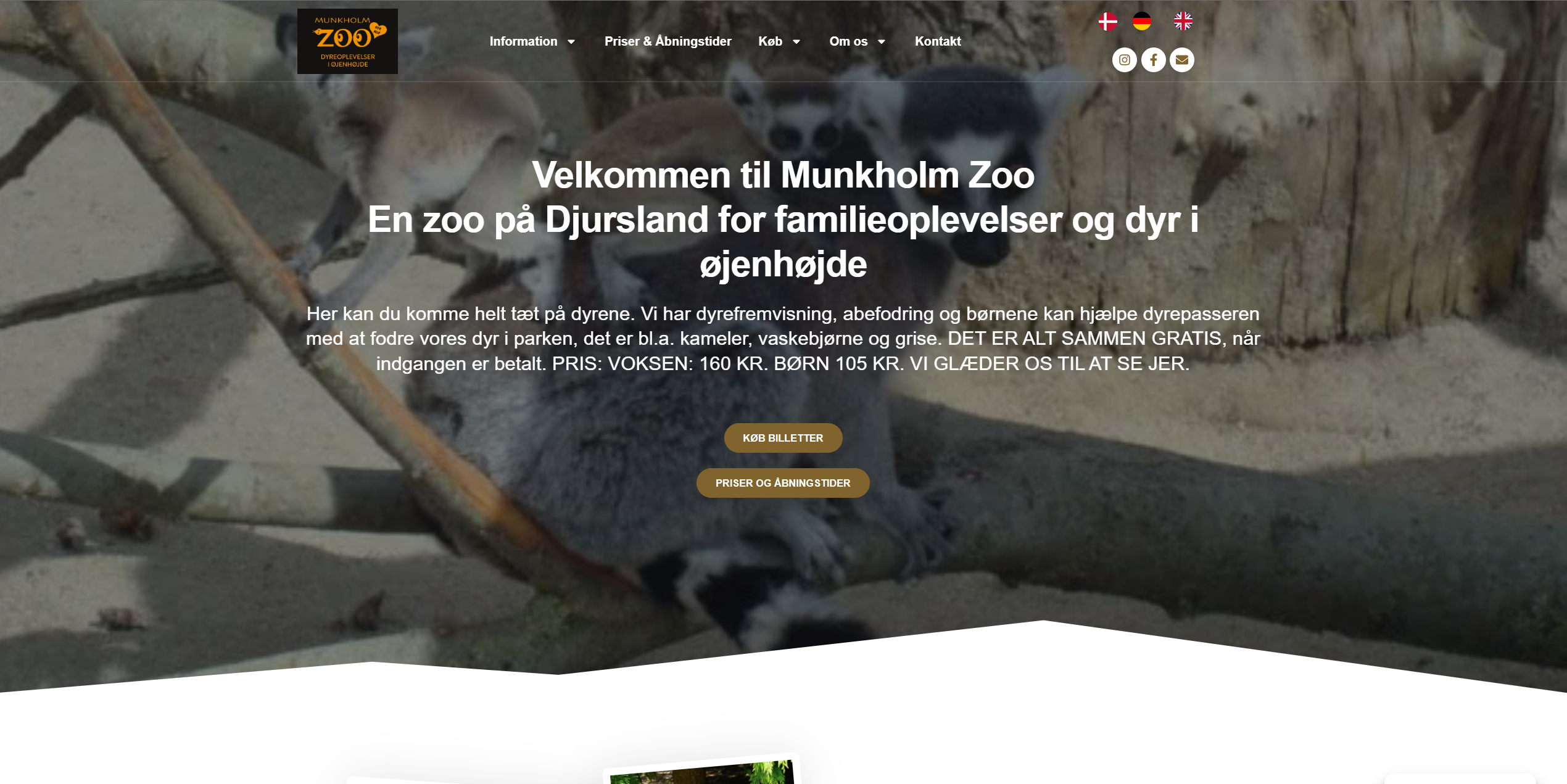
Designing a clearer digital experience

See the live prototype
Old Munkholm Zoo website
New Munkholm Zoo website

Extending the brand across social media

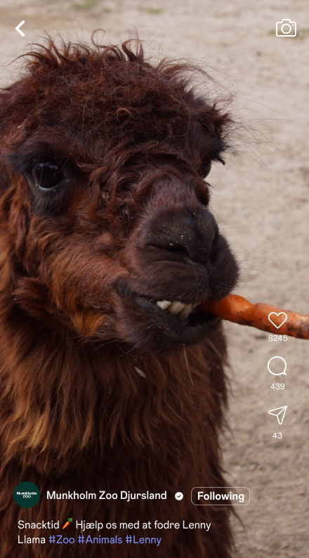
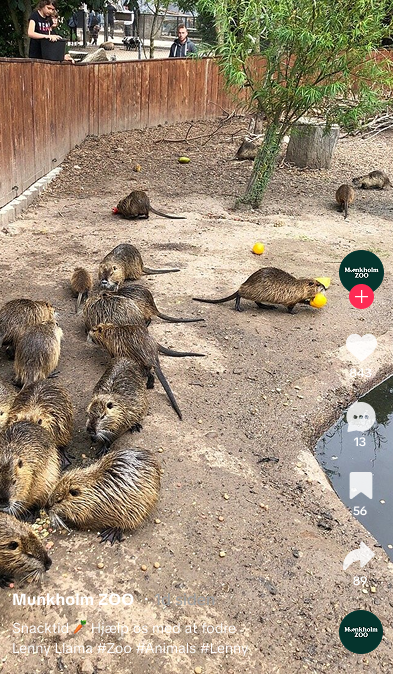
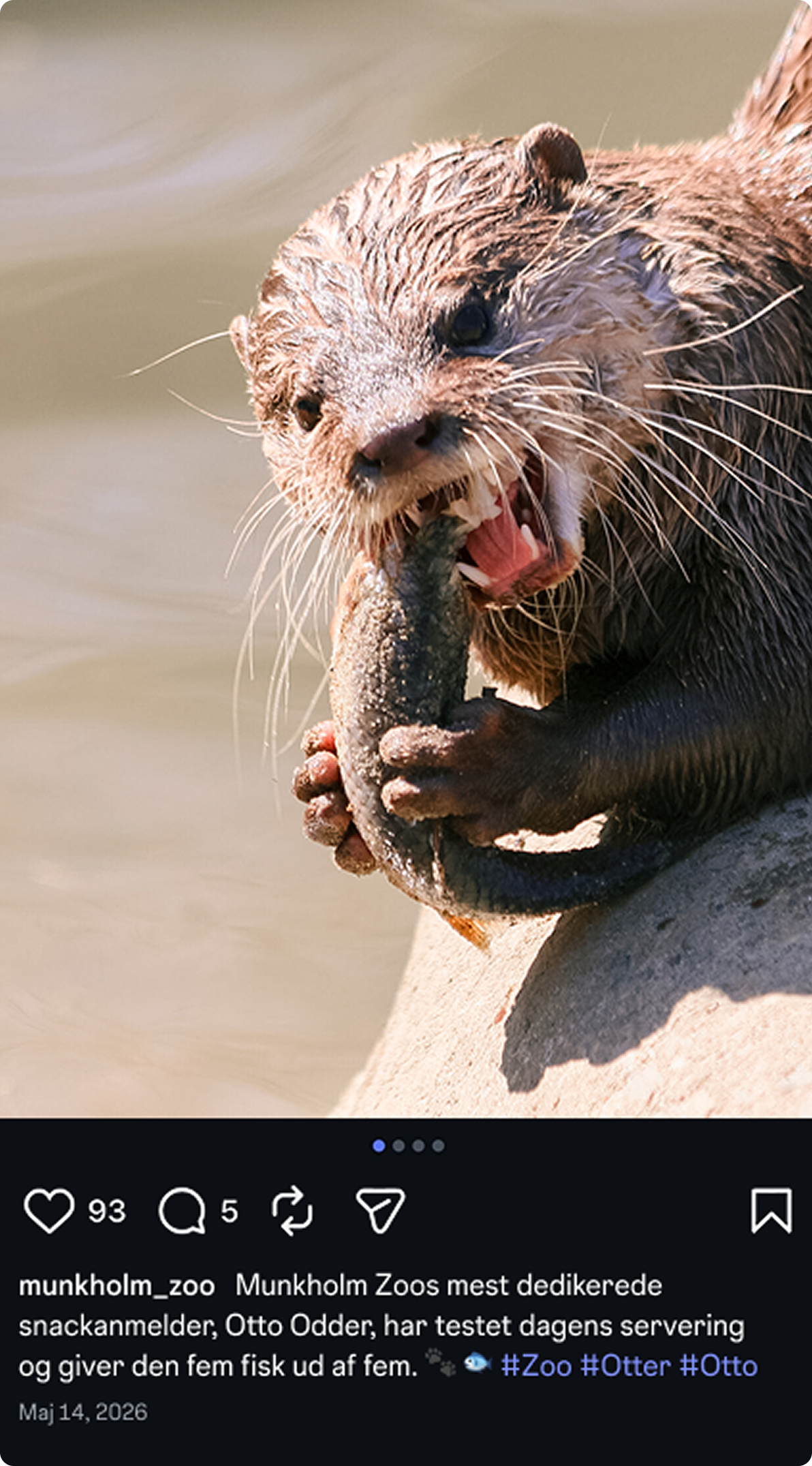
To make the identity more consistent across platforms, I created social media guidelines covering tone of voice, platform strategy, visual direction and reusable campaign formats.

The goal was to keep Munkholm Zoos authentic and personal voice, while giving the content a clearer structure and more recognisable visual system.

Munkholm Zoo social media video example
Munkholm Zoo social media post example

Testing the experience

User Test 1

Tested whether users could quickly understand the website purpose and navigate to key information.

Users recognised the site as a zoo website and were able to find central areas such as visit planning, daily program, practical information, prices and opening hours.

Outcome The navigation and information architecture supported quick orientation.

User Test 2

Tested the website first impression, clarity and visual hierarchy.

Users described the site as modern, clear, inspiring and family-friendly. Key CTAs stood out quickly.

Outcome The design communicated the purpose and main actions within seconds.

The outcome

The final solution connects Munkholm Zoo website, visual identity and social media into one cohesive digital experience.

The new structure makes it easier for users to plan a visit, while the refreshed visual identity creates a warmer, more modern and recognisable brand expression.