



Rowan bakery brand identity mockup

Rowan

Brand identity, Logo system, Packaging & Visual direction

About the brand

Rowan is a bakery concept created around warmth, craft and everyday indulgence. The identity needed to feel soft, familiar and memorable, while still working across packaging, signage, printed material and digital touchpoints.

The brand is built around a rounded wordmark, a simple bakery mark and a crumb-inspired detail system that gives the identity its own recognisable visual language.

My Role

  • Brand Designer
  • Logo Designer
  • Visual Identity Designer
  • Art Director
  • Packaging Designer
  • Brand Guidelines Designer

Tools used

Figma
Figma
Adobe Illustrator
Adobe
Illustrator
Adobe Photoshop
Adobe
Photoshop
Adobe InDesign
Adobe
InDesign

The Challenge

The challenge was to create a bakery identity that felt warm and handcrafted without becoming overly rustic or generic.

In a market where bakeries often compete through freshness, atmosphere, coffee culture and strong visual presentation, Rowan needed a flexible identity that could work across both small physical touchpoints and larger brand applications.

The identity had to feel friendly, soft and approachable, while still being clean enough for packaging, signage, printed material and a complete brand guide.


Problems

  • The identity needed to feel warm, but still polished enough for a modern bakery.
  • The logo had to work across packaging, cups, bags, signage and small printed items.
  • The brand needed a memorable detail that made it more ownable than a simple script logo.
  • The visual system had to support both bread, pastry and coffee moments.
  • The brand applications needed to feel cohesive without becoming repetitive.
  • The system needed enough flexibility to feel alive across patterns, packaging and in-store touchpoints.

Design process

Research

Concept

Identity

Applications

Guidelines

Understanding how bakery brands
create appetite, recognition and trust

Audience insights

Freshness first Bakery customers respond quickly to visual cues of craft, freshness and quality.

Warmth matters A bakery identity needs to feel approachable before it feels premium.

Everyday ritual Pastry and coffee purchases are often small comfort moments, not only practical food purchases.

Fast recognition Packaging needs to be recognisable even when seen quickly on a cup, bag, wrapper or receipt.

Desk research insights

£5.74bn The UK bakery market is a large food industry market with strong retail presence.

15.4% Coffee sales in bakery and sandwich outlets were reported to have grown year-on-year in 2025.

Coffee culture Coffee has become an important factor in how customers choose bakery and sandwich outlets.

Takeaway touchpoints Cups, bags, wrappers and receipts extend the brand beyond the physical bakery space.

What the insights revealed

The research showed that Rowan needed more than a nice logo. The identity had to create a feeling of warmth and quality across many small moments: a cup of coffee, a pastry wrapper, a tote bag, a street sign or a printed receipt.

This led to a visual system built around softness, repetition and small recognisable details, especially the crumb detail in the wordmark.

Design goals

1

Create a warm first impression

Make the identity feel soft, comforting and bakery-specific from the first look.

2

Build an ownable detail

Use crumbs as a small visual signature that makes the wordmark more recognisable.

3

Design for real applications

Make the system work across bags, cups, wrappers, menus, posters and signage.

4

Balance craft and polish

Keep the identity friendly and handmade without making it feel messy or old-fashioned.

5

Support coffee and pastry culture

Create a brand world that works for both sit-in and takeaway bakery moments.

From bakery mood
to visual identity decisions

01 Soft wordmark

The rounded wordmark gives Rowan a friendly, comforting and slightly handmade feeling.

02 Crumb signature

Small crumb details were added to the logo as a subtle, ownable brand element.

03 Warm burgundy base

The color palette uses deep burgundy and cream to feel rich, warm and bakery-led.

04 Flexible application system

The identity can scale from a simple cup logo to full patterns, signage, bags and campaign material.

Logo system

A soft wordmark with a small crumb signature.

The Rowan logo system is built around a rounded wordmark, a compact bakery mark and a primary logo lockup. The soft shapes make the identity feel warm and approachable, while the crumb detail adds a small memorable moment.

Ownable detail

How the cookie crumble

The small crumb detail is the signature element of the identity. It gives the logo a more tactile bakery feeling and makes the wordmark feel less generic.

Instead of relying only on pastry illustrations, the crumbs create a simple detail that can be repeated across layouts, packaging and brand moments.

Color palette

Warm, rich and bakery-led.

The palette is built around deep burgundy, soft cream, warm brown and dark charcoal. Together they create a visual world that feels comforting, grounded and suited for both pastry and coffee.

Burgundy

#5B0F1D

Cream

#F5EAD8

Warm Brown

#8B5E3C

Charcoal

#211C18

Brand applications

Designed to work across real bakery touchpoints.

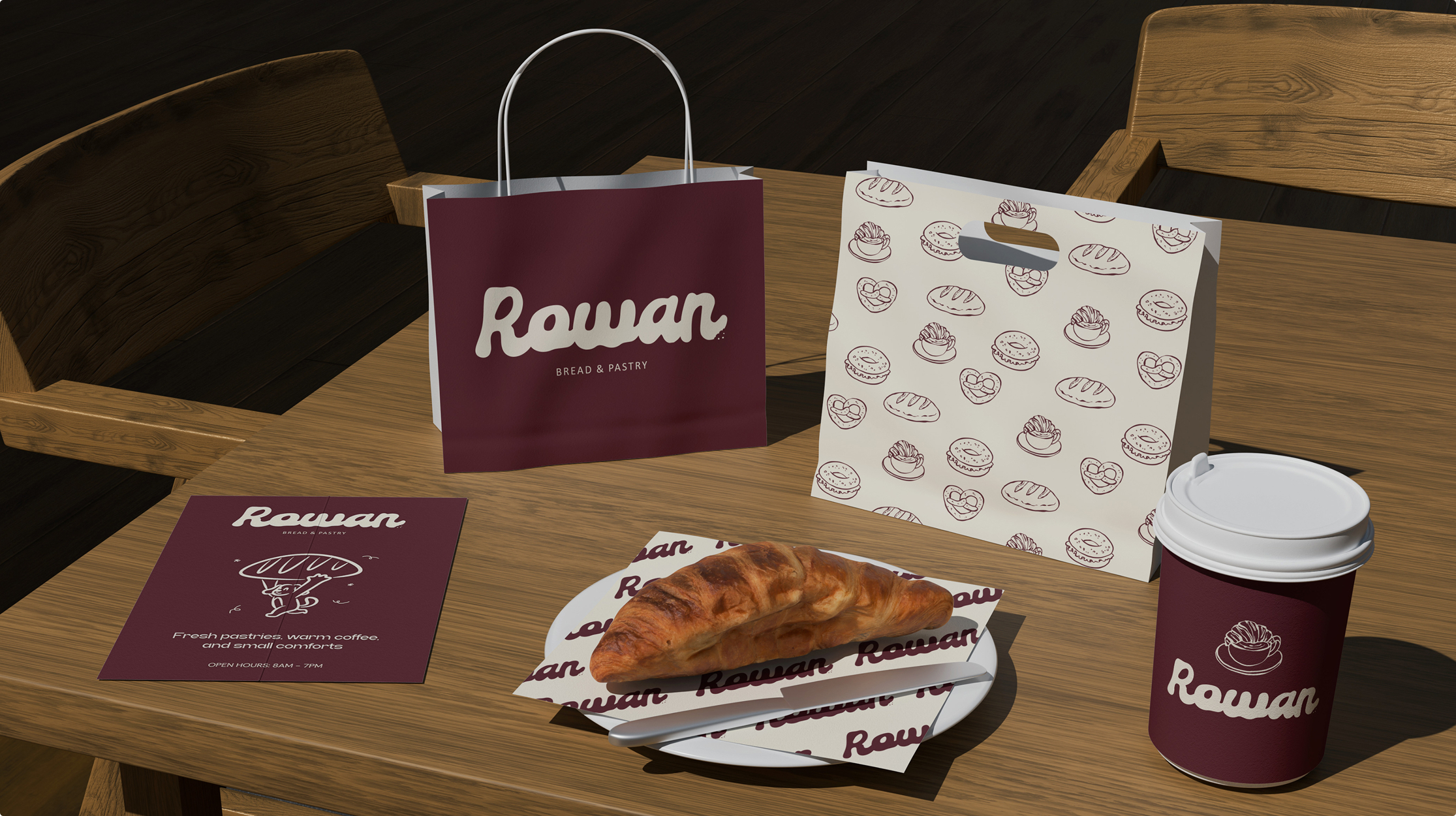
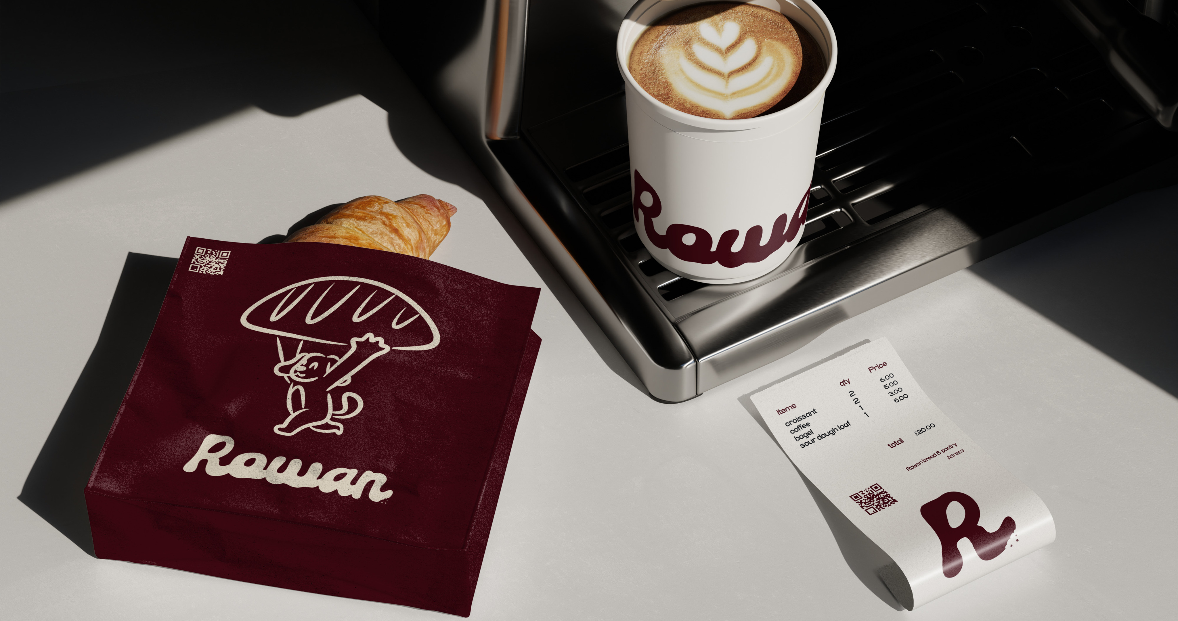
Rowan bakery packaging and table mockup
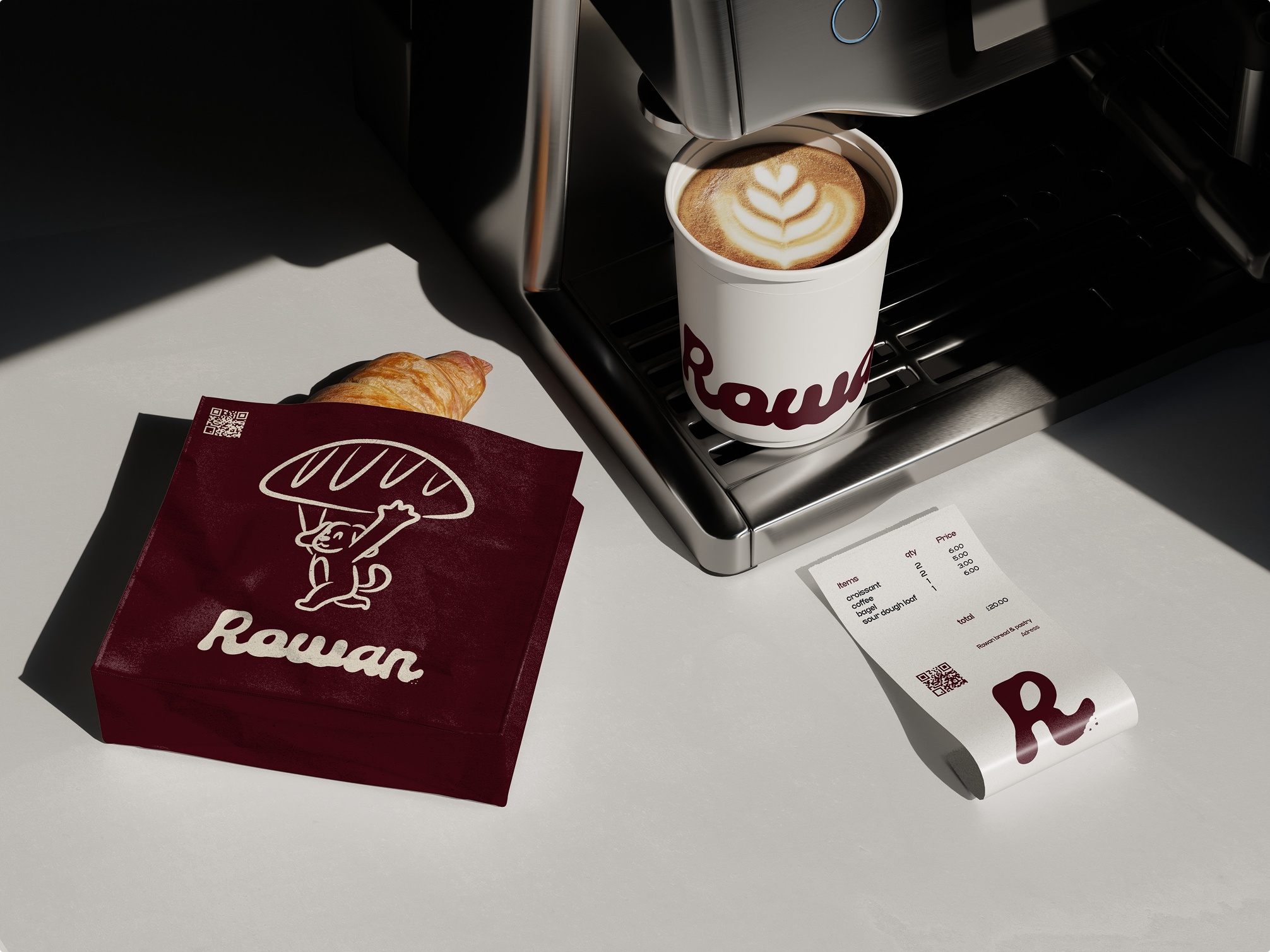
Rowan pastry packaging and coffee application
Rowan brand pattern and primary logo graphic
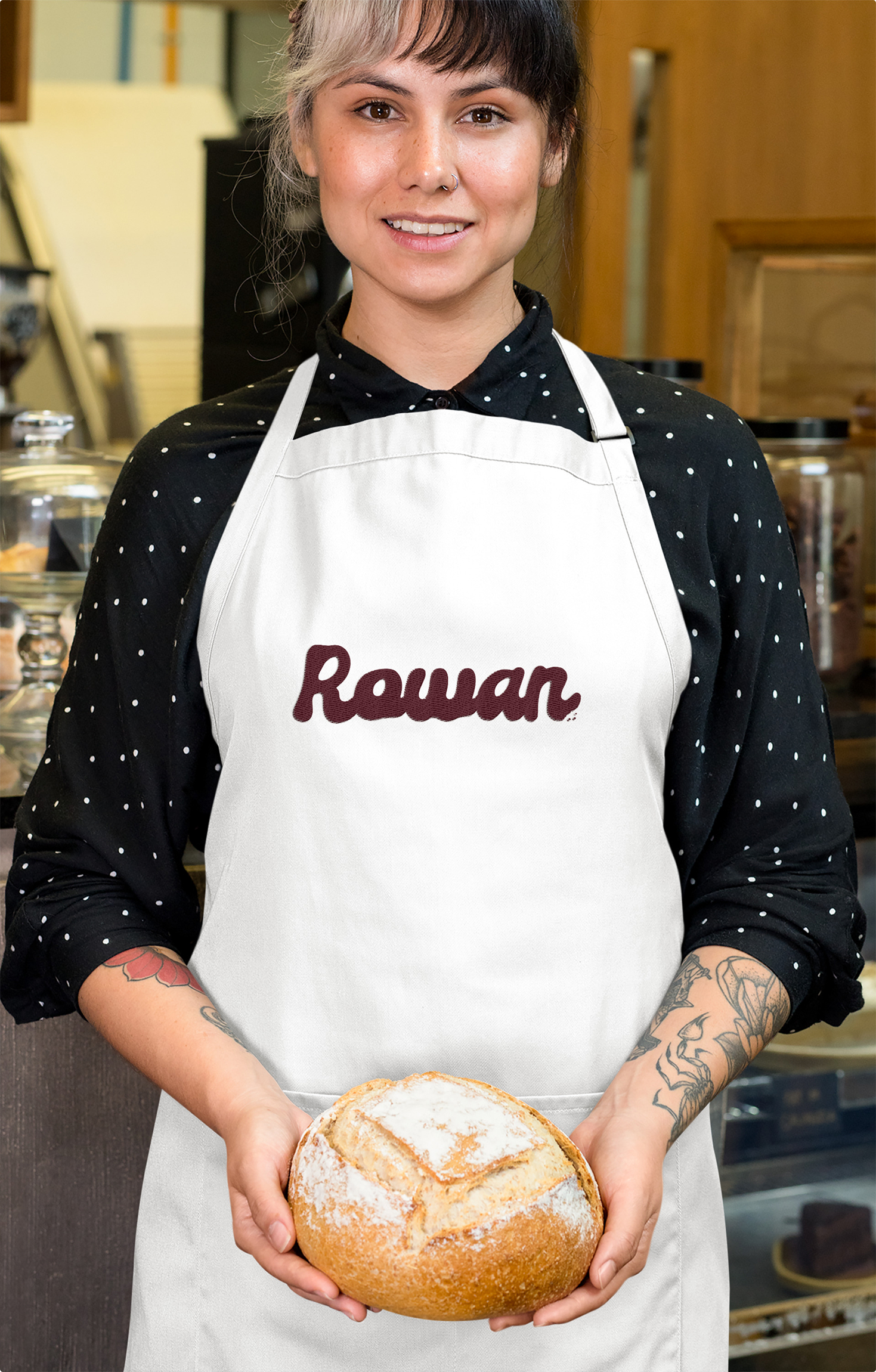
Rowan apron and employee uniform application
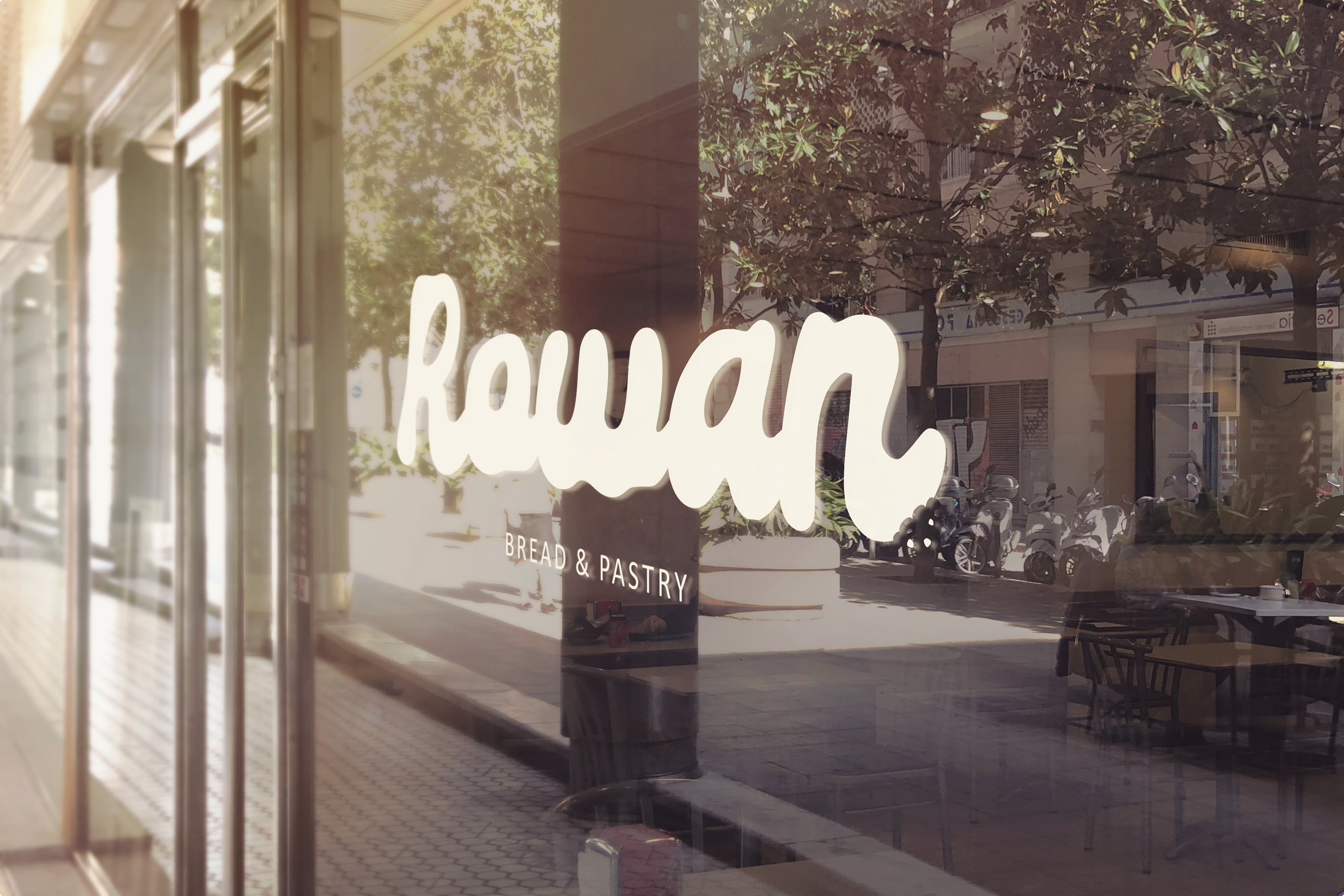
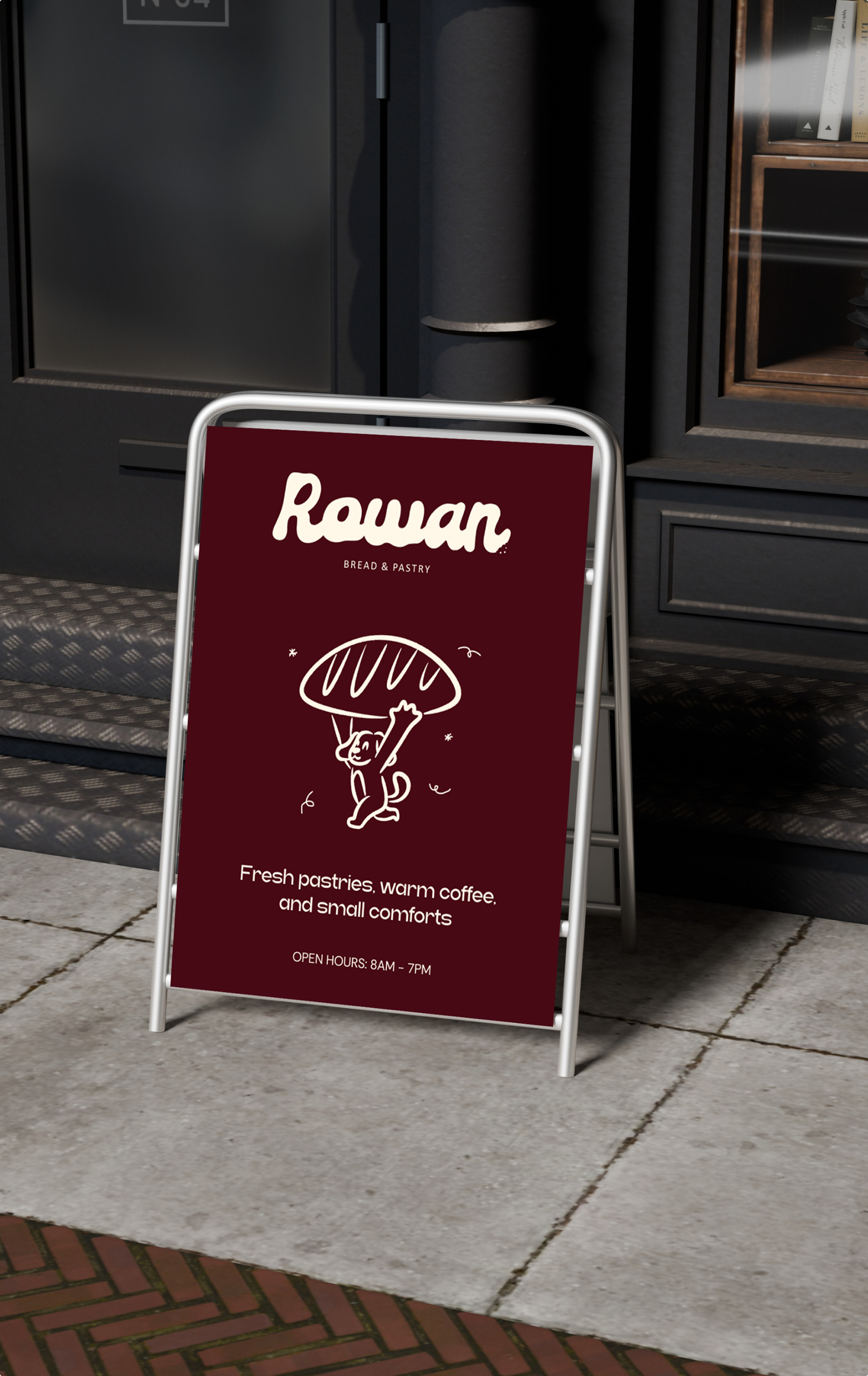
Rowan street sign application
Brand guide

Explore the full Rowan identity.

The brand guide collects the logo system, crumb detail, typography, colors, patterns and applications into one visual document.

Open PDF

Page 1 / 1

Outcome

A warm bakery identity with a recognisable system.

The final identity gives Rowan a soft and flexible bakery system built around a rounded wordmark, simple mark, crumb detail, warm color palette and brand applications that can scale across packaging, print, digital and in-store touchpoints.